

Biography
Angelica Fernandez-Lopez is a graphic designer born in the Dominican Republic and based in New Jersey since 2016. She is currently pursuing a B.A. in Graphic Design at Rutgers University. With a B.A. in Psychology, she brings an understanding of human emotion and perception into her visual practice. Her work focuses on poster design, digital illustration and motion graphics, with an emphasis on developing engaging and expressive color palettes that shape mood and visual impact. Inspired by anime, video games, and contemporary visual culture, she creates dynamic compositions that balance concept, vibrancy, and emotional resonance, often exploring playful and experimental visual narratives.
Artist Statement
Artist Statement — Motion Video
This motion graphics video is about Brutalism and where it came from, but it’s also about how I see it as a designer. Brutalism as an architectural movement used to be described as ugly, cold, or overwhelming. I was interested in looking past that reaction and focusing on its core idea: honesty. After World War II, buildings needed to be fast, affordable, and functional. Instead of hiding materials or decorating structures, architects exposed concrete, beams, and form. Brutalism wasn’t trying to impress anyone, but trying to be direct and efficient.
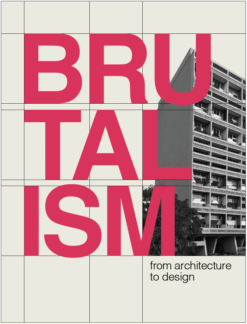
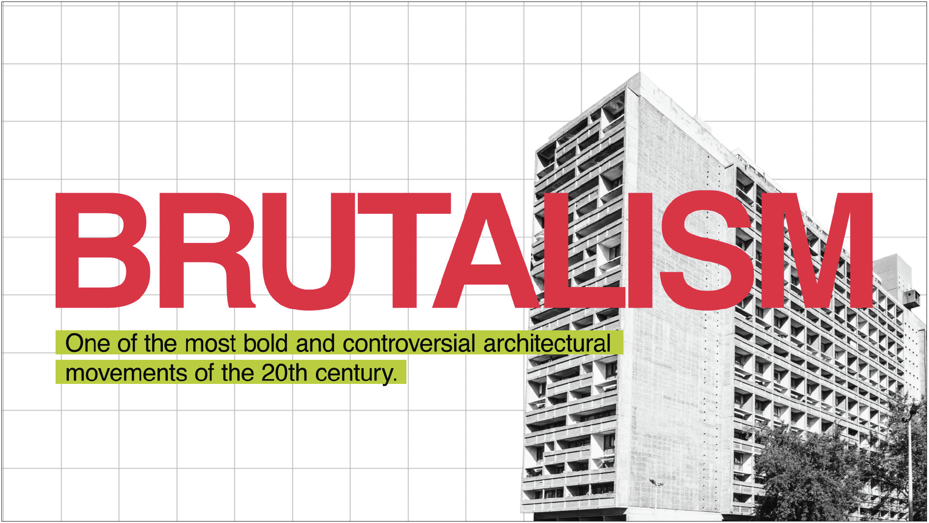
I designed the video to reflect that same feeling. The typography is bold and oversized. I used Helvetica because it’s common in today’s brutalist graphic and web design, which helped me connect the past to the present. The saturated colors are intentionally intense, and the composition feels very “in your face.” There’s also a visible grid in the background for most frames in the video, referencing both architectural structure and graphic design systems. I didn’t want the visuals to feel soft or delicate, but more like solid and intentional.
The pacing allows certain words to stand alone, like “Bold. Big. Brutal.” This makes the message feel direct and confident. I avoided adding unnecessary elements and focused instead on scale, contrast, and clarity. I also chose simple, straightforward transitions instead of flashy or decorative effects to keep the video consistent with Brutalism’s emphasis on honesty. I mainly used the program’s basic tools, focusing on the materiality of motion itself and the core tools that define motion design.
This project matters to me because it challenges the idea that design always has to be subtle or traditionally beautiful. Brutalism shows that something can feel heavy, loud, or minimal and still be meaningful. Through this piece, I wanted to explore that tension and reflect it in my own design choices.
Artist Statement — Thesis Book
This thesis book explores Brutalism beyond architecture, looking at how its ideas can be expressed in graphic design. I wanted to create something that combines both how Brutalism looks and what it does, adding a sense of efficiency with the careful crafting usually found in graphic design. To do this, I researched Brutalist architecture, design, and history, focusing on the aspects I felt were most important to understanding its background and influence.
The book’s design translates Brutalist principles into a graphic system, incorporating ideas from modern Brutalist graphic design. The typography is straightforward and clean, using Helvetica to keep things neutral and clear. Color is used in a high-contrast way to create emphasis and guide attention. Most of the architectural images are monochromatic so the focus stays on form and texture, while other imagery remains in color to preserve its original qualities. These choices were meant to keep the visuals direct and intentional without feeling overly simplified.
The layout is built on a grid that organizes the content across the book. Even when it isn’t visible, it helps maintain consistency and structure. I didn’t want the system to feel restrictive, so the design relies more on spacing, alignment, and contrast to create movement and hierarchy. Scale also plays an important role: larger type and full-bleed images are used to give certain ideas more presence and to shape the pacing of the book.
Working on this project changed the way I think about design. It made me pay attention to what’s really necessary and what actually contributes to the message. Brutalism doesn’t try to hide anything, and it’s intentional about what it shows. It’s a way to show that design doesn’t have to be about decoration. It can focus on efficiency while still balancing beauty and functionality. I focused on making design choices that followed this idea, keeping the book clear and purposeful.